The new “Analyze” feature for Business Central that is coming in April 2023 and it is the Cat’s Meow!!! For all of us that are not Power BI Gurus, Reporting Writing Experts or Excel SuperUsers, even we can Analyze data with the click of a few buttons right inside BC.
I don’t know everything about this new feature, but with a few clicks, I did the following. First, go to Features Management and enable the Analysis feature. Next, pick a list and work through these steps.
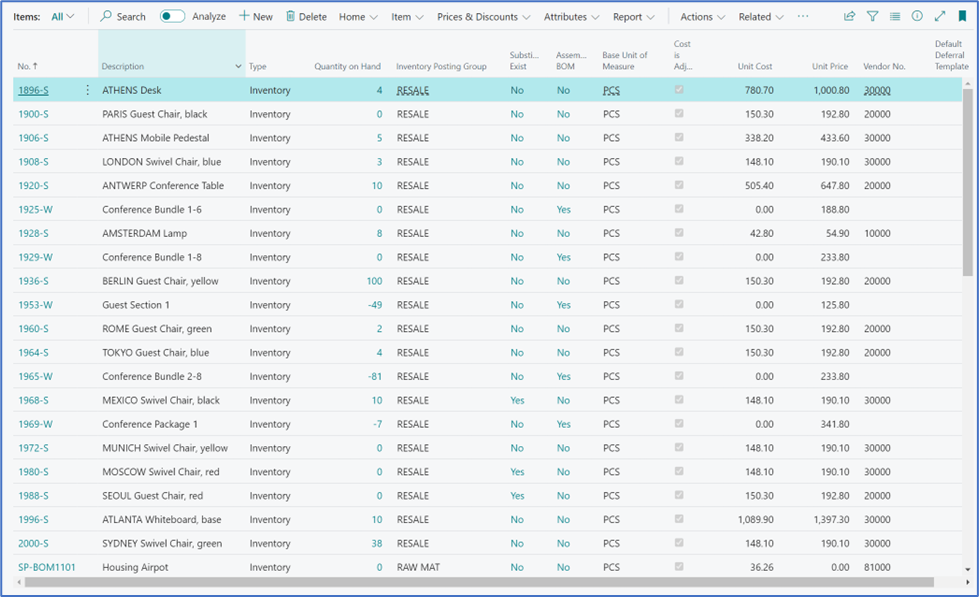
- Went to my item list, standard list nothing really different.
2. I do see the new Analyze toggle, so I turned it on….

3. And the item list seemed not to change, but it did!!
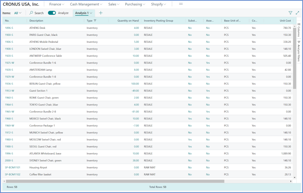
4. There are three (3) areas added to the list page when in Analysis mode
5. When I looked a little closer..
a. Every other line shaded, kinda like a table in Excel
b. A total at the bottom of the screen
c. Options on the right side (field modifier area)
Now it was time to explore…..
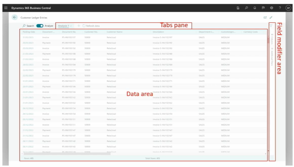
6. First, I checked out those options on the right side in the ‘field modifier area’. Columns and Filters were the options so I started with Columns. And the following menu appeared.
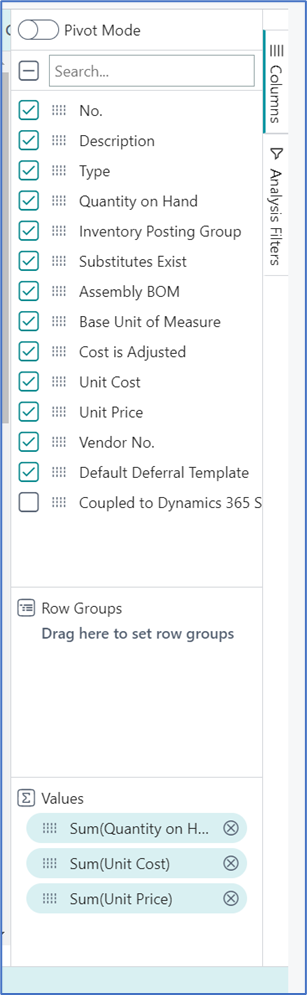
7. Hmmm, I began with unchecking some fields and I watched as instantaneously fields were removed…..no Personalization required. I wanted the Inventory Posting Group and since it was not on the page, I did have to Personalize. Once I added that field, it became a column that I could remove. Here’s the screen shot after removing fields and adding inventory posting group.
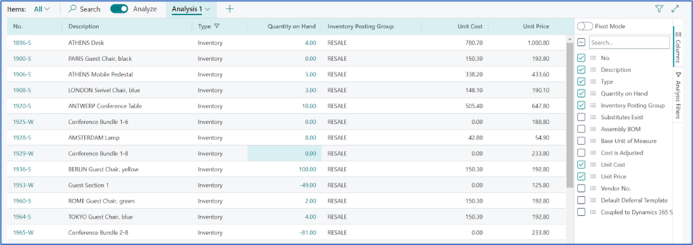
This is better than Edit in Excel!!!!
8. Back on the Column piece there is a section called Row Groups. That sounds interesting, what does that do? It’s literally a method to group your data!
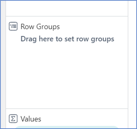
9. Had to give that try and that’s when I started smiling and laughing out loud!!!!! I dragged the Inventory Posting Group into Row Groups…. Abbracadabbra!!
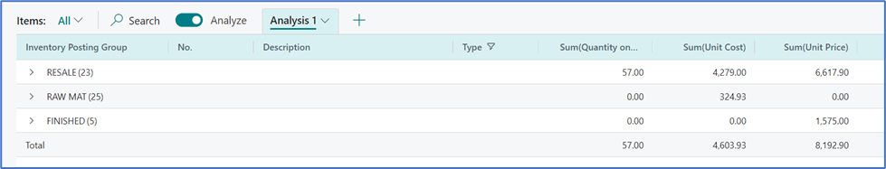
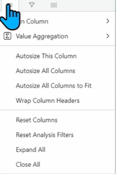
10. In the above example, the columns do not wrap well, this can be fixed by pointing to the column header, choosing the hamburger and then autosizing.
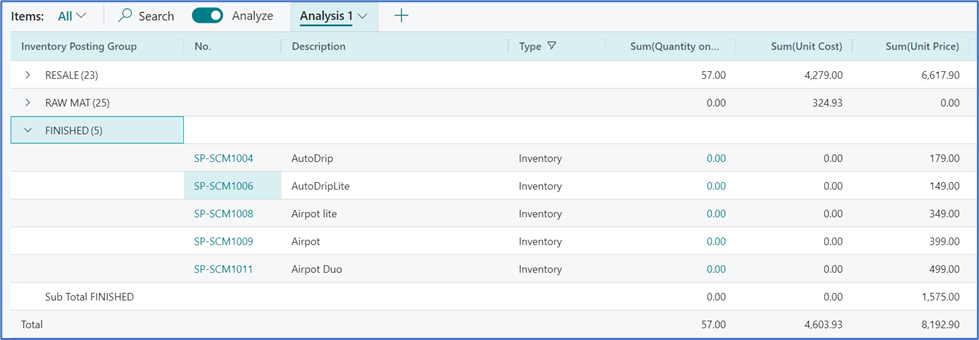
11. You can expand each section to see all of the items, take a look below. I think I want to use this all the time for my item list!
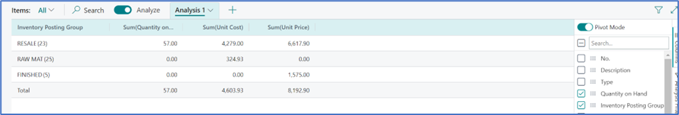
12. Also in the Analyze Pane, there is a toggle for Pivot Mode. When clicking on Pivot Mode, the data display is automatically changed.
13. Once in analyze mode, you can highlight a few lines and at the bottom of the page, the data is filtered and summed similar to Excel.

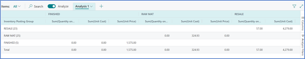
14. And at the bottom of the Analyze Pane, when in pivot mode, a new option to Change Column Labels which doesn’t really change the names of the columns but rather creates a new view.
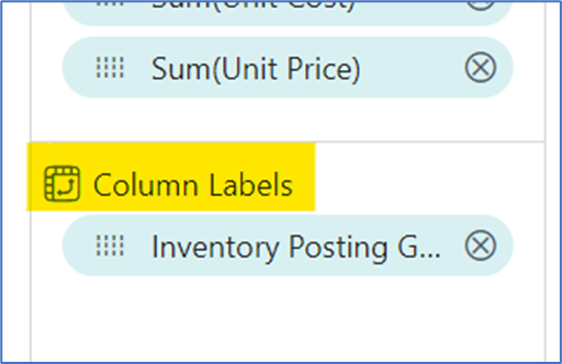
I did a drag and drop of the Inventory Posting Group, and the view became…
15. Back to right side options, you can apply Filters for any of the fields on the page.
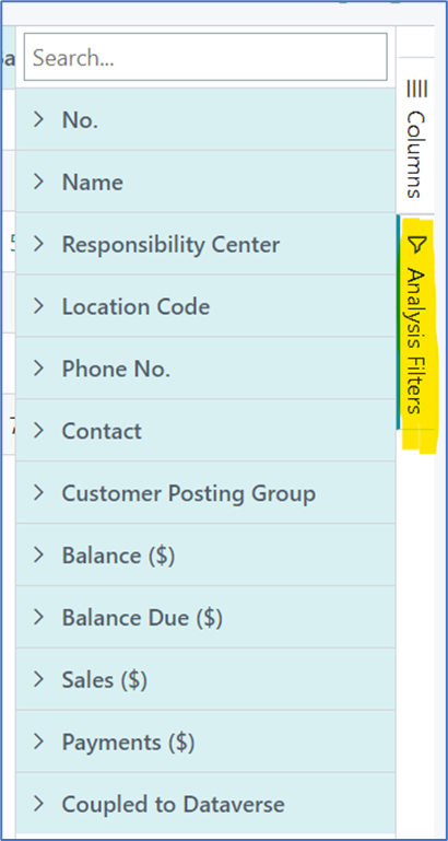
16. You can organize the columns, freeze the columns left or right (pin column) and much more.
17. And still more, you can have multiple Analyses and name them as desired. The first screen below shows two analysis views before the names are changes and the second screen shows after each was given a name.
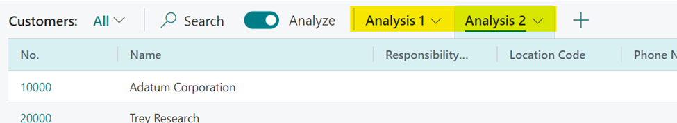
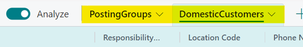
18. Did I mention that they automatically save? And that you can name them as you desire.
19. There are a couple of options for copy and paste into Excel, either by a random select, group or everything.
20. Virtually every list page that I opened, I had the ability to use the Analyze feature. Imagine using these on customer, vendor and item ledger entries pages! The applications are limitless. As soon as your database is updated to version 22, go to Feature Management and enable this feature, I think your users will be super excited, I know I am!
I have a lot to learn about to fully utilize this great feature and I can’t wait to explore more.