WOW, I’m so Excited for the Excel Layouts in BC version 20 (Wave 1 2022)!
I didn’t know how this would really work and I was worried that it would be hard to learn. I couldn’t wait to try it and see what could be done. I started out without any knowledge or instruction and within my first hour, I printed a report to Excel, added a Pivot table, updated back to Business Central and reran the report that had the Pivot table imbedded. I have so many more ideas to try, but let’s keep it simple for the first round…..
AMAZING, EXCITING, FABULOUS, AWESOME and every other word that makes you feel good!!!
This is not just another Excel Report and it’s not Power BI. And reports that already had the Print to Excel toggle are great but the majority of BC reports do not have a good Excel layout that can be used as a simple report or for analysis. Now we do, easy for users and powerful.
Krzysztof Bialowas recently posted a BLOG on this same topic but with a little more technical flare, https://www.mynavblog.com/2022/05/04/excel-reports-something-new-in-reporting-space/ , and one of the things that he quotes in his blog is from the Launching Event Session … ‘Excel Reports shifts the responsibility from developers to consultants in terms of layout.’ He further states that ‘First, it is easier for the consultants to add the columns, charts, formulas, etc. than have a whole dialog with a developer. Second,…the reports are something developers hate to do.’ Could not have said that any better and for consultants that mean more work but it also means that users can do a great deal of the prep work even if a developer is called for to build extended datasets.
Let’s me show you the that I did steps…this is my second time working through them. So I may have done extra but it worked….so here goes:
Decided on Item Sales by Customer Report and listed below are the steps that I did.
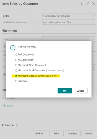
Step 1 Run the Report to Excel
Step 2 – Open Excel Report (enable editing)
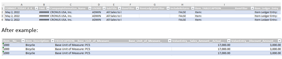
I removed a lot of columns that I really did not want….
Before and after example of a few columns. Images are blurry but you should be able to see the differences in columns.:
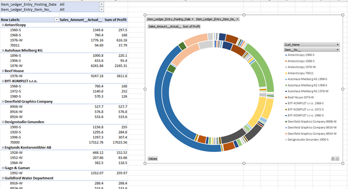
Step 3 Add Pivot Tables, Charts, Graphs, Power Pivot, Attach other sources.
I did a Pivot table, with filters and a doughnut chart. I’m reviewing item sales by customer, as well as, profit by item by customer.
In Excel, I built and saved the following spreadsheet.
Step 4 Create a new Report Layout
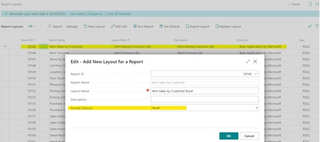
Once you press OK, you will be prompted to ‘choose’ and then use your browser to find your file.
Step 5 Verify that your Excel layout Exists.
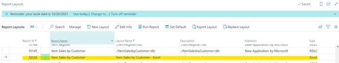
Step 6 – Run Report again. You can run from Report Layouts or better yet, if you want the Excel version to the be standard Edit the report type in Report Selection Layouts.
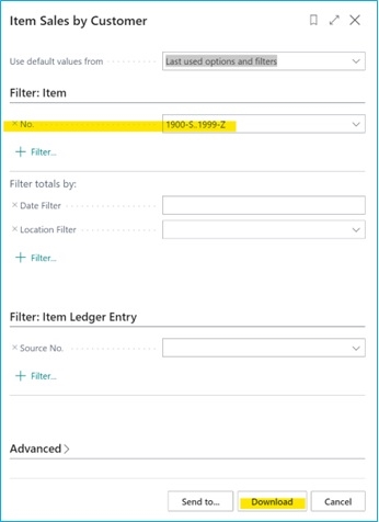
This time I ran the report for a range of items, not all the items…
Step 7 – Excel opens and Abracadabra!!
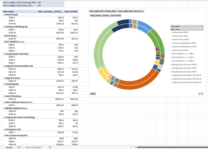
You can enable editing and allow for the pivot table to be edited….or not.
I can apply filters at the top as built into my pivot table.
I am truly an Excel Novice and I’m super proud of this spreadsheet. The column edits that I did in Step 2, were kept, so even if you are not interested in the visuals, this is a create way to get your data into Excel and condense the columns. There is a Analyze Data menu option in Excel and when I receive 25 different visuals to choose from….didn’t use them because I found them after this was complete. Too many more things to try. I want to connect to outside spreadsheets, connect two reports together….Share what you learn and what you’ve built!